While I've been away, I haven't been entirely lazy.
I've been thinking a lot while I lay on the couch in a nausea induced stupor.
One of the things I've been thinking about is color.
More specifically, what colors we should paint our house.
Yeah, that's right, we still haven't picked colors.
And, truth be told, the house isn't entirely ready to be painted. But choosing colors is waaaay more fun than scraping, so that's where we are right now.
Who am I kidding? I am going to be sitting on the sidelines while Aaron scrapes and primes and paints. The least I can do is put a little thought into paint colors.
Looking at these flowers in my bathroom got me thinking about yellow.
I am becoming very fond of yellow.
And it is a very mid century choice, as seen in this fab house in Palm Springs.
The white, dark brown trim and saturated yellow door just has mid century written all over it.
And you know how we feel about mid century.
But, I like a little more color. The dark brown isn't cutting it for me.
The reason I love these yellow flowers so much is that they are paired with the turquoise.
They make each other pop.
I am fond of yellow, but I love turquoise.
Turquoise looks good with almost any color.
For example, notice the pine with the orange heart and turquoise leaves.
Isn't it beautiful? (why did I not buy that pin?)
Here is orange and a pale, not quite turquoise but trying, combination.
I like it, but again, I am looking for more pop.
Pop like this.
Orange doors and those beautiful turquoise bikes.
Now that is what I'm talking about.
I am also a fan of this appley green, as seen on that awesome basket chair.
It looks good with orange.
And turquoise.
You don't believe me?
Well, feast your eyes on this place.
It has one of the most perfect color combinations I have ever seen.
I lust after the paint colors on this house.
The key I think is moderation.
Mostly white, with carefully placed bright colors.
Like the green trim and a few turquoise accent walls.
(and the peacock? swoon.)
And alongside one of the turquoise walls, an orange door and orange house numbers.
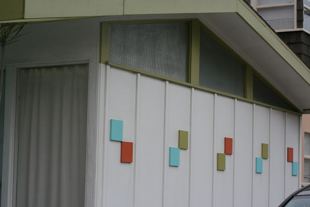
And on that big white wall, the small blocks of those 3 fabulous colors.
They look so good together.
Mid century with a pop.
Adding yellow to the mix might be too much. Even for us.
But I have a strong feeling that those other colors might find their way onto our house.
Give us another 6 months (at least) and you'll find out.
Now back to the couch I go.
Love from,
Greta


2 comments:
G,
Is that your little house? I absolutely LOVE it. I would love to live in a mid-century modern house like that. I would love a visual tour (more photos!).
My fav color combo are the exact colors in your sample shot of the 562 address. Subtle turquoise blue with a pop of orange. Perfecto!
Still can't believe that is your adorable little house.
Rock it, girl.
I love the peacock colour combination. Maybe with a bit of yellow? Either way, you've got some great ideas, can't wait to see how it all turns out.
Hope you're feeling better. x
Post a Comment